My rental wall looked sad, so I built a Victorian picture frame wall with a thrifted gilt frame, IKEA frames, and one Dollar Tree print I swapped for cream paper. I kept the finish warm gold, mixed sizes, and used a glue gun for tiny fixes. Then I tried a dark wall, a leaning console vignette, and a floor-to-ceiling cluster. It felt rich fast, not fussy, and the best layered trick comes later.
Key Takeaways
- Use thrifted gilt frames in warm gold or bronze tones for an instant Victorian, timeless look.
- Anchor the wall with one large frame at eye level, then build a symmetrical cluster around it.
- Mix large anchors with smaller 8×10, 5×7, and tiny oval frames for a collected, layered effect.
- Keep spacing tight, around 1–3 inches, and use overlapping frames to add depth and visual richness.
- Choose sepia art, botanicals, or portrait prints against dark walls, damask wallpaper, or antique-cream mats.
Ornate Gold Frame Gallery Wall
After staring at a blank wall in my hallway for way too long, I finally tried an ornate gold frame gallery wall, and wow—it turned the space from “meh” to “did I just move into a stylish old house?”
I kept it beginner-friendly with a few IKEA frames, some Dollar Tree finds, and a glue gun for little fixes, then mixed in one big 24″x30″ piece with smaller 8″x10″ and 11″x14″ frames so the whole thing felt balanced instead of busy.
I chose warm gold gilding, sepia art, and antique botanicals.
I spaced everything 1–3 inches apart, centered it at eye level, and checked frame conservation before hanging.
Dark Wall with Antique Frames
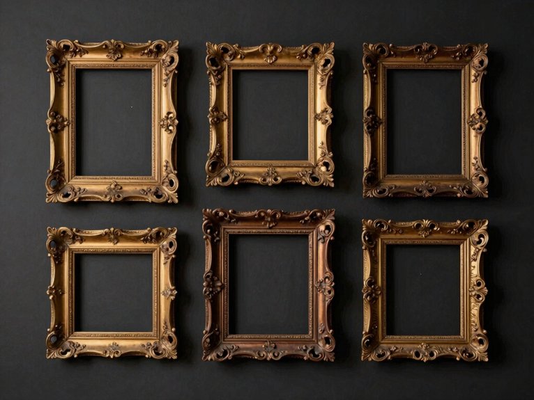
My plain hallway finally looked moody instead of boring when I tried a Dark Wall with Antique Frames on a deep charcoal wall, and wow—those old gilt frames suddenly felt like they’d stage lights on them.
I mixed IKEA frames, a few Dollar Tree finds, and one stubborn glue gun project, then hung the biggest piece first at eye level so the whole wall felt pulled together without looking fussy.
If you’ve got a blank wall that’s been giving you “rental sad,” this setup brings in that dramatic Victorian feel fast, and I’ll show you the easy tricks that made mine work.
Moody dramatic backdrop
I mixed IKEA frames with a Dollar Tree gold frame, plus one big 24×30 anchor piece. A glue gun helped me layer smaller 8x10s and 11x14s into a moody vignette that felt collected, not crowded.
I hung the centerline at 58 inches, then staggered frames a few inches. Warm picture lights made the gilt glow in my shadowed alcove, and antique-cream mats kept it classy.
Mixed Size Vintage Frames
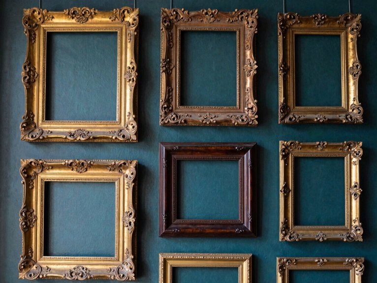
When my blank wall started looking like a sad waiting room, I knew it needed more than one big frame to feel special, so I started playing with Mixed Size Vintage Frames.
I grabbed IKEA frames, Dollar Tree finds, and a glue gun, then built asymmetrical clusters with eclectic matting to make the whole wall feel collected, not copied.
I began with two big anchors, then tucked in smaller 8x10s, 5x7s, and 4x6s, mixing portrait, horizontal, and one tiny oval.
I kept 2–4 inches between frames.
The wall now feels warm, layered, and oddly like it knows me.
Symmetrical Victorian Layout
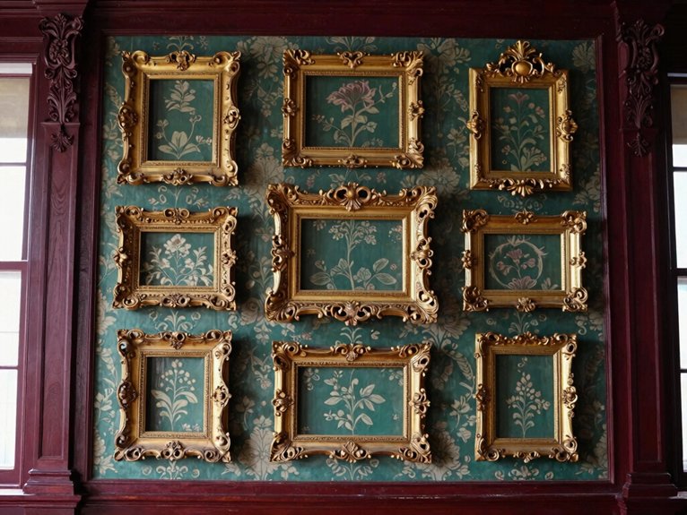
For this kind of setup, I keep the frame styles matched—heavy carved wood or gold leaf works best—and I hang the center piece around eye level, about 57 to 60 inches from the floor.
When my mantel centered wall felt awkward, I fixed it with a symmetrical arrangement that finally looked calm and proud.
I use IKEA frames, a glue gun, and Dollar Tree botanicals, then mirror smaller pieces outward from one large gilded frame.
Two tall portraits on each side help me lock in the grid.
It’s simple, affordable, and honestly, it makes my room feel like it belongs to us.
Layered Frames Over Wallpaper
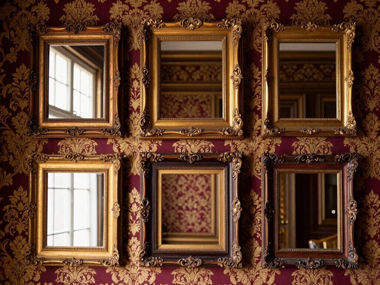
My blank wall used to look lonely, so I tried Layered Frames Over Wallpaper with a small damask print and a few IKEA frames, plus one thrifted oval piece that felt a little extra in the best way.
I started with the biggest gilt frame first, then overlapped smaller Dollar Tree frames over it, and I left a slim edge of wallpaper showing so the pattern still had room to shine.
It took a glue gun, a level, and one tiny mistake I’m still pretending was “intentional,” but the classic pattern pairing made the whole wall feel pulled together fast.
Classic pattern pairing
I started big in the center, eye level, then added smaller oval and rectangular frames with a glue gun and a little patience.
The period textile feel came alive fast, and the pattern scale kept things calm.
Near the end, I overlapped frames slightly.
Tiny chaos, big charm.
Empty Frame Wall Display
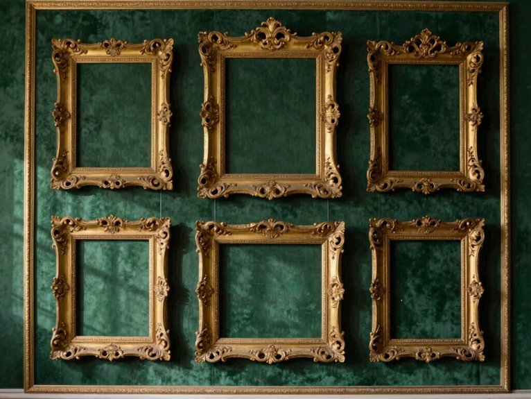
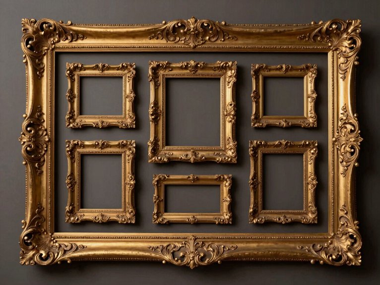
When a wall feels flat and a little sad, I reach for an empty frame wall display because it can turn a blank spot into something that looks rich, old, and collected over time. I mix IKEA frames and Dollar Tree finds, then hot-glue them in a loose cluster. | Frame | Mood |
| — | — |
|---|---|
| Oval | soft |
| Carved | grand |
| Mini | found |
I keep 2–4 inches between pieces and line the middle at eye level. The empty openings give lovely negative space, and the carved edges catch shadow play on olive paint. One crooked frame? I call it “character,” not a mistake.
Black and Gold Frame Combination
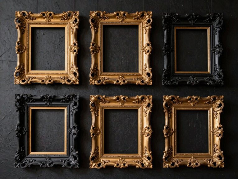
I anchor the wall with one big frame, then tuck smaller prints around it.
The best part? Frame conservation still matters, so I clean gently and avoid overworking the finish.
Portrait Art in Vintage Frames
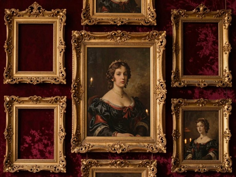
My blank wall looked plain and a little sad, so I started playing with portrait art in vintage frames and suddenly my hallway felt like an old-world set from a cozy movie.
I mixed an IKEA frame, a Dollar Tree oval, and a glue gun fix-up with sepia prints, and that little mess actually gave me a rich Victorian feel without spending much.
If you want that same collected-over-time look, I’ve got a few easy tricks that make even a tiny portrait feel grand.
Old-world aesthetic
I mixed portrait art with vintage frames and felt like I’d joined a cozy Victorian club.
- Start with an IKEA oval frame.
- Add Dollar Tree gold paint.
- Use a glue gun for beaded trim.
- Try patina preservation on older pieces.
- Back delicate prints with textile backed frames.
I hung a sepia portrait at eye level, then staggered smaller ones around it. The wall felt rich, not fussy.
My biggest win? A tiny misfit frame suddenly looked like heirloom art.
Floor-to-Ceiling Frame Wall
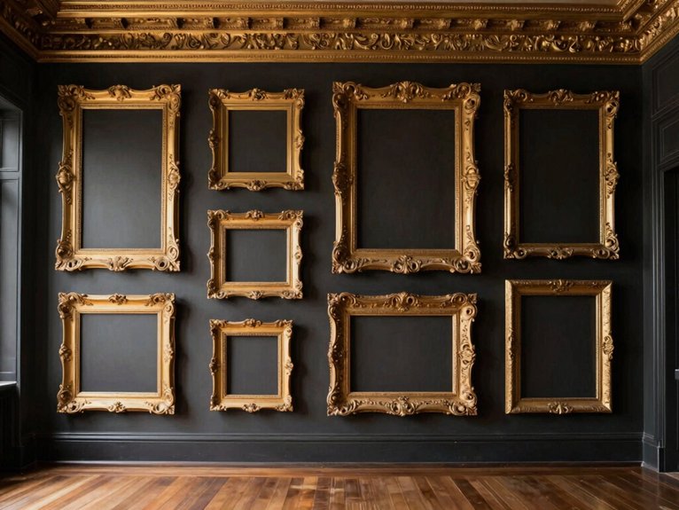
I mix IKEA frames, Dollar Tree finds, and a few ornate pieces, then layer them with a glue gun.
I keep heavier frames low and lighter ones high, like Victorian moldings climbing upward.
A charcoal wall helps the gold pop.
Sepia photos and one tiny mirror? That’s the sweet spot.
Baroque Style Frame Collection

For a simple start, I grab a glue gun, a few frames in mixed sizes, and one consistent finish so the wall doesn’t turn into visual soup. I love Baroque style because it feels grand, but still welcoming in my small hallway.
- I mix IKEA frames and Dollar Tree finds.
- I keep gold or bronze tones steady.
- I add old prints for easy charm.
- I think about ornate frame conservation as I dust.
- I notice ornamental motif symbolism in every shell and leaf.
I hang one big frame at eye level, then build around it with 2-inch gaps. It looks collected, not crowded.
Deep Jewel Tone Wall with Frames
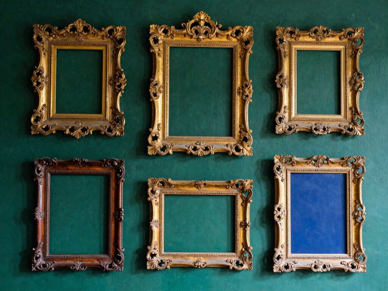
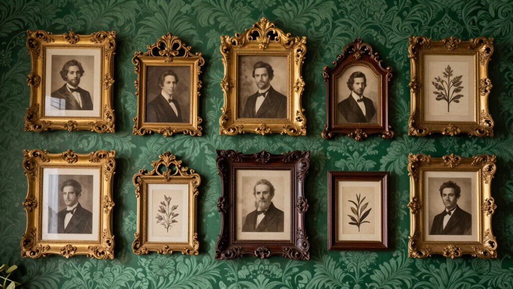
My blank wall felt flat and a little sad, so I tried a Deep Jewel Tone Wall with Frames in emerald, and wow—my thrifted gilt frames finally looked like they’d a reason to show off.
I mixed in a few burgundy accents with IKEA frames, Dollar Tree prints, and a glue gun fix or two, and the whole wall started feeling rich instead of fussy. If you’re after that moody Victorian look, I’ve found the real trick is letting those deep green and burgundy tones do the heavy lifting while the frames do the bragging.
Emerald, burgundy tones
The emerald made the gilt edges glow, and the sepia photos suddenly looked elegant instead of dusty, which was a nice surprise. I painted my wall deep emerald, then added burgundy touches with velvet drapery contrasts and gemstone inspired textiles, and suddenly the room felt like ours.
- I used IKEA frames and Dollar Tree mats.
- I spaced them 2 inches apart.
- I mixed gold-leaf and dark wood frames.
- I aimed a warm lamp at my favorite portrait.
- I slipped in one charcoal frame as a quiet break.
My glue gun earned its keep, and the whole wall felt rich, cozy, and not at all stuffy.
Leaning Large Antique Frames
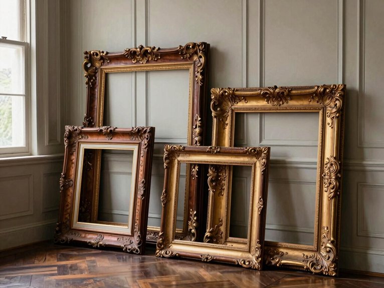
When a blank wall was making my hallway feel a little too “rental sad,” I started leaning large antique frames instead of hanging them, and honestly, it fixed the whole mood fast.
I used a 30-inch gilt frame from a thrift store, plus a Dollar Tree print swapped for cream paper, and set it on my console for a quick mantel vignette vibe. I keep the visual center near eye level, then tilt it back a touch for angled safety.
For extra charm, I overlap a smaller frame, add books, and watch the space feel collected, warm, and finally mine.