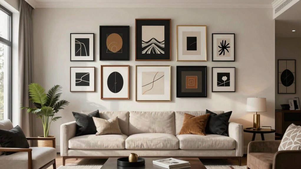
A blank living room wall can feel rude, so I start with 14 wall frame ideas for living rooms that look stylish and balanced. I lay IKEA frames and Dollar Tree finds on the floor, then build a grid, a crooked-as-intentional gallery, or one big anchor over the sofa. A glue gun, level, and 2-inch gaps keep me sane. My favorite trick? Save the gold frame for last—it quietly steals the show and makes the whole wall click.
Key Takeaways
- Use one central anchor piece at eye level, about 6–12 inches above the sofa, to set scale and focus.
- Build balanced layouts with 2–3 inch frame gaps, then add rows or staggered pieces instead of leaving large empty spaces.
- Mix frame finishes and sizes, like black metal, natural wood, and one gold accent, for a collected but cohesive look.
- Create visual interest with asymmetry, off-center anchors, or a loose grid of smaller frames to avoid a “stamp collection” effect.
- Style the wall with meaningful photos, abstract art, or memorabilia, and add picture lights or shelves for a polished finish.
Gallery Wall Grid Layout
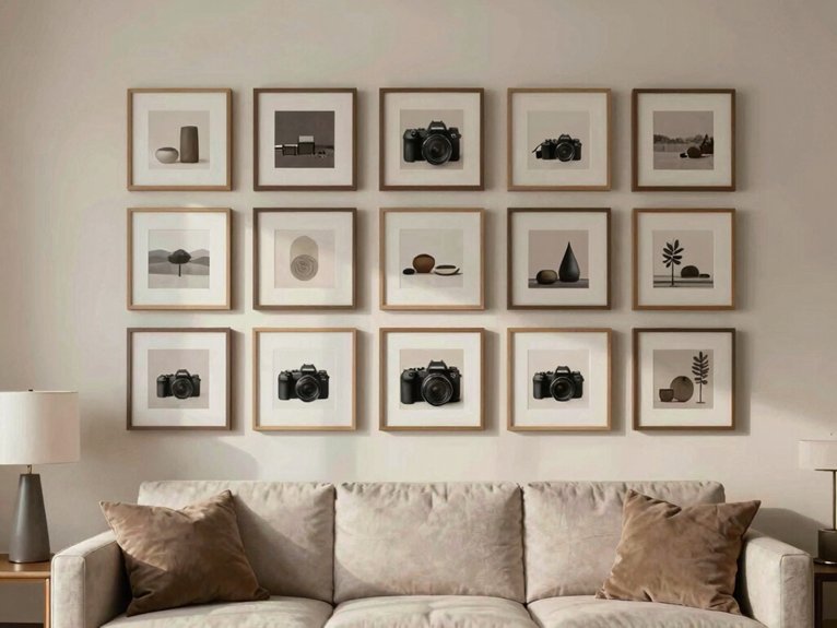
I usually start by laying everything on the floor, then measuring the full shape before I touch the wall. A grid calms a busy living room fast, and I love using frame templates and a spacing calculator so I don’t guess like a raccoon with a ruler.
I pick matching IKEA frames or Dollar Tree finds, then keep one mat opening and one theme. Next, I mark the wall, use a level, and leave 2–3 inches between frames. I center the block at eye level, about 57–60 inches up. On big walls, I add rows, not extra gaps. It feels polished, cozy, and doable.
Asymmetrical Frame Arrangement
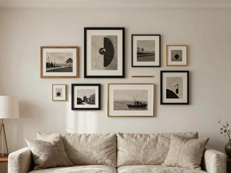
When a living room wall feels flat but a full grid feels too strict, I usually reach for an asymmetrical frame arrangement instead. I start with one off-center anchor, then add smaller IKEA frames and Dollar Tree finds around it, leaving negative space so the wall can breathe.
A glue gun helps me fix tiny details fast, and I mix black, wood, and one unframed print for layered textures. I stagger the gaps a bit, keep the bottom just above my sofa, and balance one dark piece with a lighter one. It looks relaxed, not lopsided—like my room finally joined the conversation.
Large Statement Frame Centerpiece
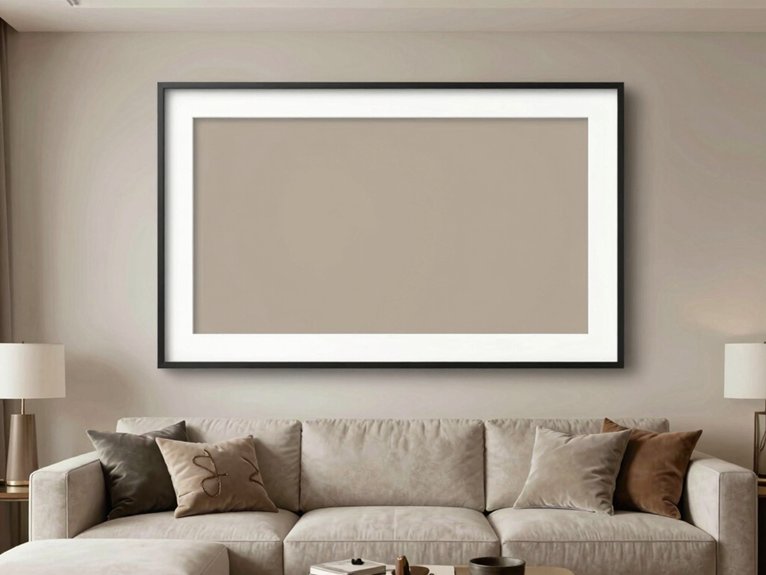
When my sofa wall felt weirdly empty, I fixed it with a large statement frame centerpiece that instantly gave the room a real focal point.
I picked a 40-inch IKEA frame, matched its black finish to my trim, and hung it so the center sat just above the couch—my glue gun and a couple of Dollar Tree spacers made the job easier than I expected, honestly.
A single oversized print with cozy colors can pull the whole room together, and if you add a small picture light later, it starts looking a lot fancier than my budget should allow.
Focal point design
My easiest DIY version uses an IKEA frame, a simple print, and a couple of Dollar Tree items for a quick mockup before I commit. I start with scale harmony and check viewing distance from my sofa.
| Piece | Size | Effect |
|---|---|---|
| Frame | 36–48 in. | Grounds the wall |
| Bold or soft | Sets the mood | |
| Light | Sconce or lamp | Adds drama |
I hang it 6–12 inches above the sofa, or center it at 57–60 inches. Then I match the frame to my trim. A little glue gun fix, and boom, my room feels like it belongs to us.
Black and White Photo Wall
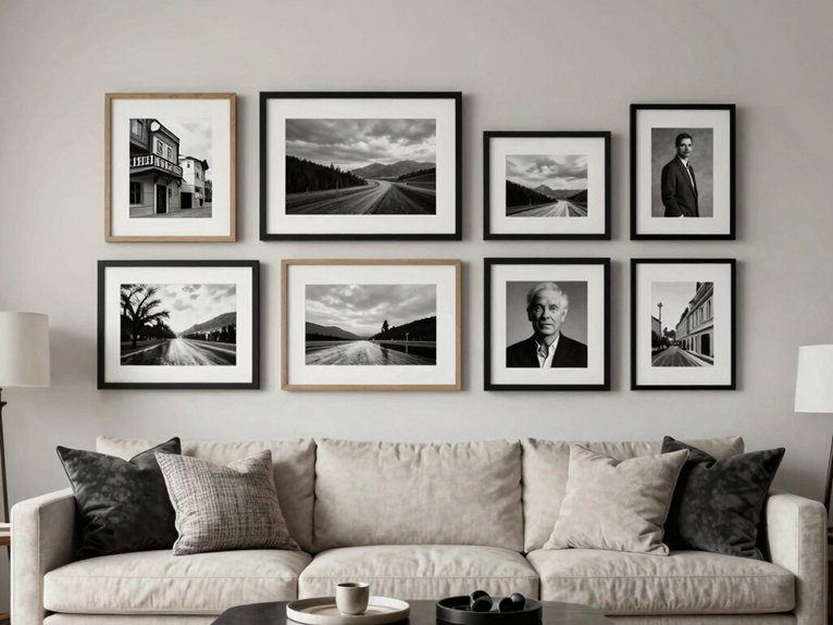
I started with cheap IKEA frames and a few Dollar Tree mats, then tested my layout on the floor before touching a single nail. My black and white photo wall gave my living room high contrast storytelling and real tonal consistency, like our memories finally agreed to behave.
- a 16×20 anchor at eye level
- a neat 2×2 grid above my sofa
- soft picture light for depth
I used a glue gun, level, and painter’s tape to check spacing. Mixing portraits, buildings, and a beach shot kept it personal, not random. Honestly, it felt like my wall joined the family.
Mixed Frame Styles and Sizes
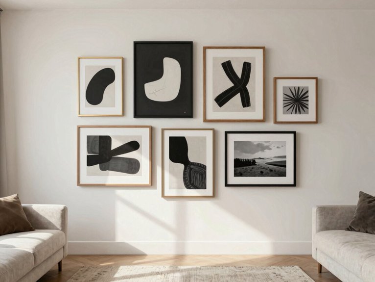
The trick was keeping it from feeling messy. I started my frame pairing with one big IKEA frame, then added Dollar Tree 8x10s around it for scale harmony. I mixed simple black frames with one ornate thrift-store frame, about 60/40, so it looked collected, not chaotic.
I kept mat widths the same with a glue gun and cut scraps, which sounds fancier than it is. Small wins, right? I left 3 inches between each piece and flipped a few to horizontal. Then I tucked in a tiny shadowbox. My wall finally felt like my people live here.
Minimalist Two-Frame Setup
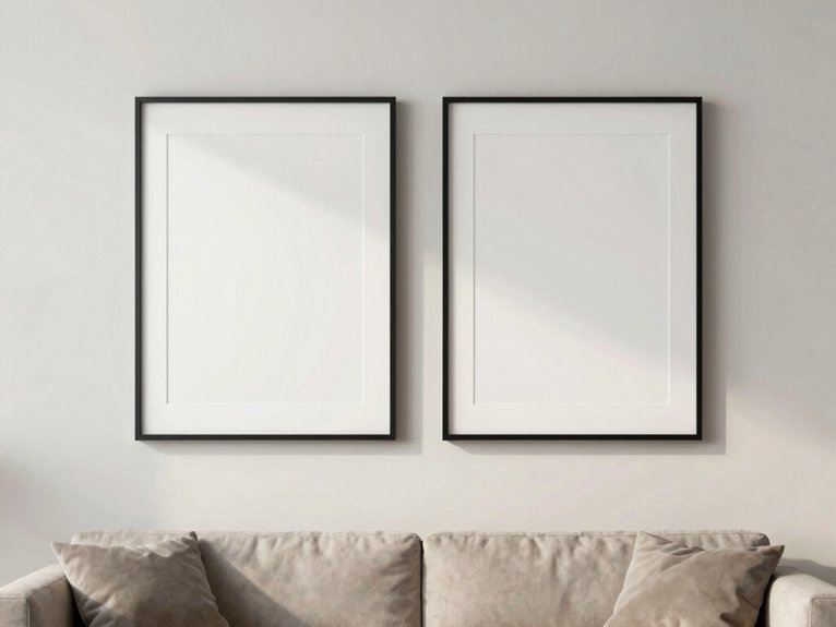
When my living room wall looked awkward and empty, I fixed it fast with a minimalist two-frame setup, and it gave the space a clean aesthetic without much fuss.
I used two IKEA frames, a glue gun, and simple black-and-white prints, then hung them about 8 inches apart so the sofa area finally felt calm instead of bare. If you want a tiny upgrade that looks polished, I’ve found that matching frames with one small size difference can quietly do a lot of work.
Clean aesthetic
For this look, I start with two large matching frames, usually 24 x 36 inches, and hang them just 2–4 inches apart above the couch. My living room finally felt calm, not busy.
- I grab IKEA frames, Dollar Tree hooks, and a glue gun for quick fixes.
- I use monochrome texture prints and 1–2 inch mat spacing so the art breathes.
- I center the pair at eye level, then test it from the sofa.
A black frame set on my neutral wall gave me that “yes, I live here too” feeling. Once, I leaned one frame on a console, and it looked oddly cool.
Floating Shelf with Frames
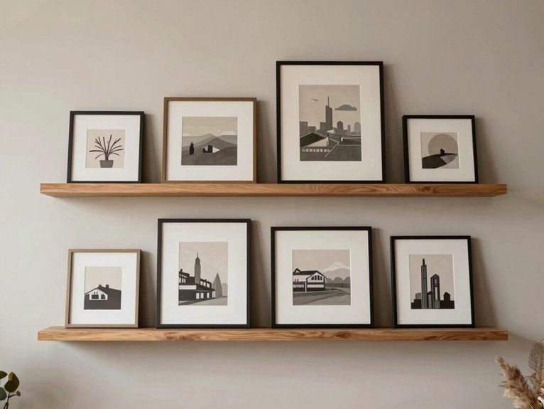
My living room used to feel stuck in that awkward zone where the sofa looked bare, but any art I hung behind it felt way too heavy. I fixed it with a floating shelf with frames, and honestly, it felt like giving the wall a friendly handshake.
I used a 6-inch IKEA ledge, Dollar Tree frames, and a glue gun for tiny hidden lighting clips and plant accents. I mounted it 8 inches above the sofa, then layered a big print in back and smaller ones in front. Mixed black, wood, and gold frames. Kept mats white. One small vase finished it. Easy, cheap, and way less scary than extra holes.
Floor-Leaning Large Frames
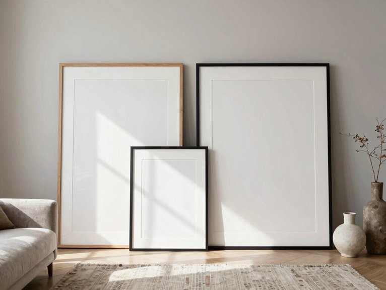
The shelf looked good, but I still had one blank stretch of wall that made my sofa area feel unfinished, like it was wearing one shoe. I fixed it with floor-leaning large frames, and now it feels like my people live there too.
- an IKEA frame resting on an anti-slip pad
- a smaller Dollar Tree frame overlapping it like a leaned sculpture
- soft ambient lighting washing the mat so it doesn’t glare
I kept the big frame 2–4 inches from the baseboard, then nudged a second frame in front for depth. A tiny glue gun felt silly, but a wall hook behind the top edge stopped wobble. Easy, cheap, and oddly classy.
Symmetrical Sofa Wall Layout
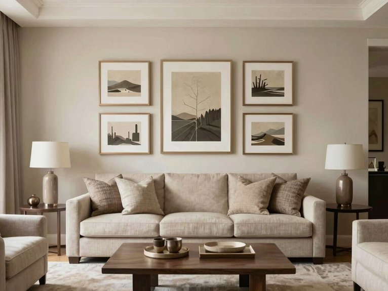
My sofa wall used to look oddly empty, but a Symmetrical Sofa Wall Layout fixed that fast and gave the room a calm, balanced look.
I centered one big IKEA frame above the couch, then added two matching Dollar Tree frames with a little help from my glue gun, and honestly, the whole wall suddenly felt like it knew what it was doing.
If you want a clean win, this setup’s easy to measure, simple to hang, and way less bossy than my last crooked try.
Balanced look
- one big IKEA frame above the sofa
- two Dollar Tree frames beside it
- a glue gun for quick fixes
I center the large frame 6–8 inches up, then mirror the sides 4–6 inches apart.
Same finish, same mats.
It looks polished, and wow, the wall finally behaves.
Vintage Frame Collection
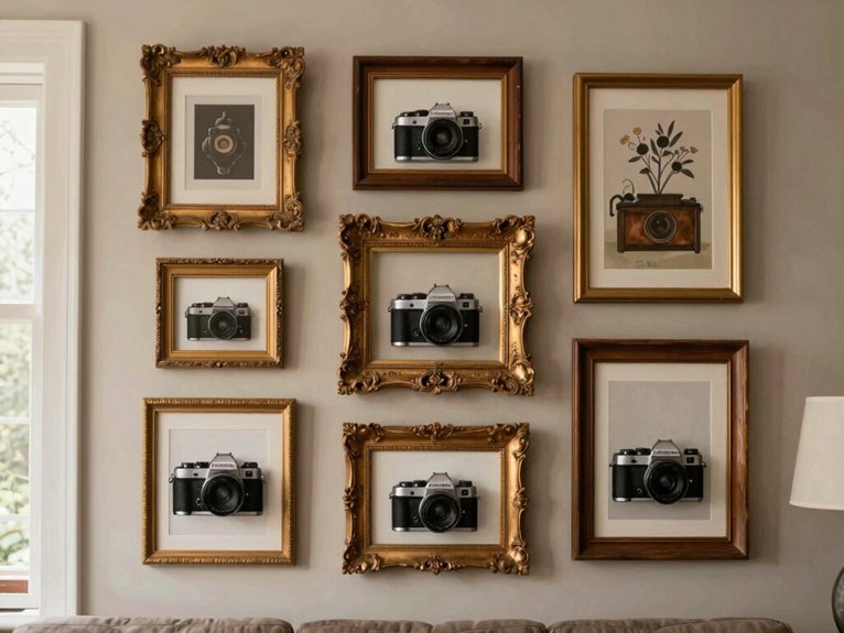
When my living room wall looked more “rental blank” than cozy, I started playing with a vintage frame collection, and honestly, it changed the whole mood fast. I hunted thrift stores for distressed gold, walnut, and patinated bronze, then did gentle patina preservation with a soft cloth and tiny dabs of glue gun frame restoration on loose corners—very glamorous, I know.
I mixed one big frame with smaller 8x10s and 16x20s, then filled them with black-and-white photos and charcoal sketches. The wall felt collected, warm, and finally like my people lived here. The trick? Keep spacing even, but let mats vary.
Neutral Tone Art Frames
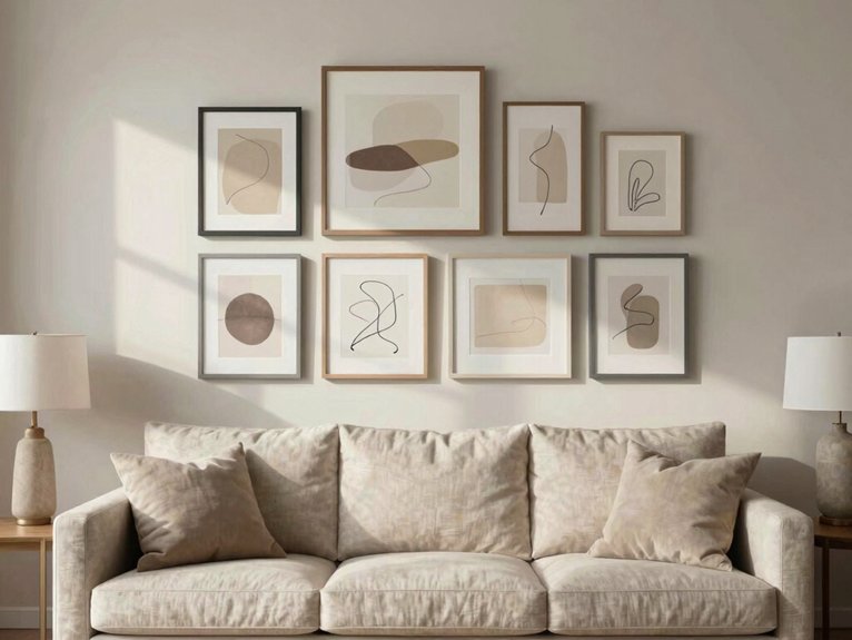
Even a plain living room can feel calmer fast with neutral tone art frames, and that’s exactly what I needed when my walls started looking a little too “waiting room” for comfort.
I picked IKEA frames in matte black and soft white, then added Dollar Tree cream mats for a muted palette.
- one 16×20 anchor with tiny 8×10 prints
- 2-inch gaps for easy balance
- a glue gun fix for wobbly corners
I kept 2–3 repeat hues, adding texture contrast with a linen canvas. One 40-inch piece on my mantel sealed the cozy win.
Personal Photo Story Wall
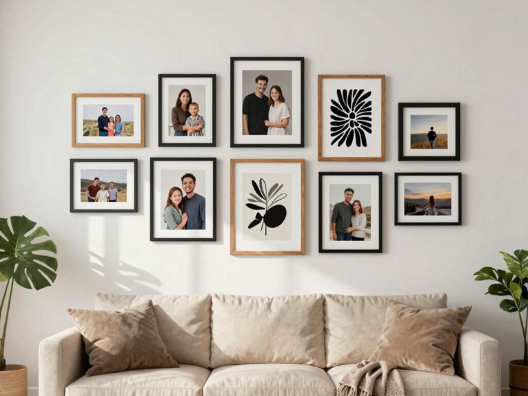
My blank living room wall used to feel like a giant “we’re still figuring this out” sign, so I turned it into a personal photo story wall with a big IKEA frame in the center and smaller Dollar Tree frames around it.
I kept the frames simple, added a glue-gun fix or two when I measured wrong, and mixed in a tiny map and a ticket stub for that “oh, I recall that trip” feeling.
It’s meaningful decor that makes guests smile, and honestly, it beats staring at an empty wall like it owes me money.
Meaningful decor
I like to treat it like a story: one central anchor photo, then smaller shots that branch out with vacations, holidays, and goofy everyday moments.
My living room wall finally stopped feeling empty once I built this personal photo story wall with IKEA frames, a glue gun, and a few Dollar Tree mats.
I grouped family heirlooms and candid prints by theme:
- a painted family tree with sentimental captions
- 4×6 and 8×10 frames in a repeat pattern
- one black-and-white print for calm contrast
I hung it 6 inches above the sofa.
It feels warm, balanced, and very us.
Abstract Art Frame Mix
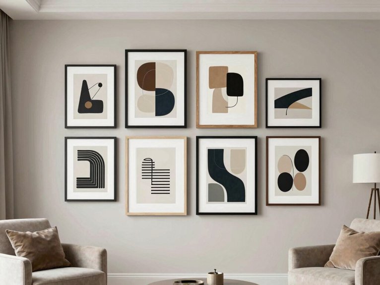
The trick that saved me was scale: I used one big framed abstract piece as the anchor, then added smaller 12–24 inch prints around it so the wall didn’t look like a stamp collection.
I grabbed IKEA frames, a glue gun, and a few Dollar Tree mats. I mixed thin black metal with natural wood, but kept just two finishes so it still felt like my crew.
Repeating bold textures and color echoes—deep green and warm beige—made everything click.
I hung the center at eye level, then shifted one piece off-center. Tiny mistake, big win.
Gold Frame Luxe Wall
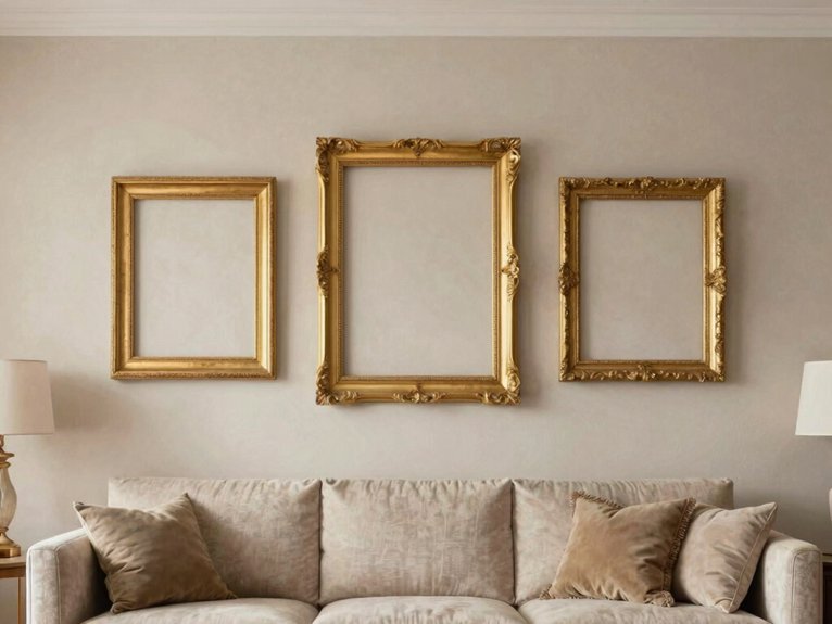
When my living room started feeling a little too “basic rental,” I went looking for a gold frame luxe wall fix that wouldn’t eat my whole weekend or budget. I mixed IKEA frames, Dollar Tree prints, and one thrifted piece with antique patina. A glue gun helped me keep it sane.
- one big sofa anchor
- 4 tiny frames in a loose grid
- a cream mat and woven art
I kept frame widths even, around 2 inches, so it felt like I belonged there. Then I added reflective textures and picture lights. Suddenly, cozy looked classy, not fake.